October 12, 2025


Year
2025
Client
SARAH LILY
Category
WINE BAR
Product Duration
1 - 2 WEEKS
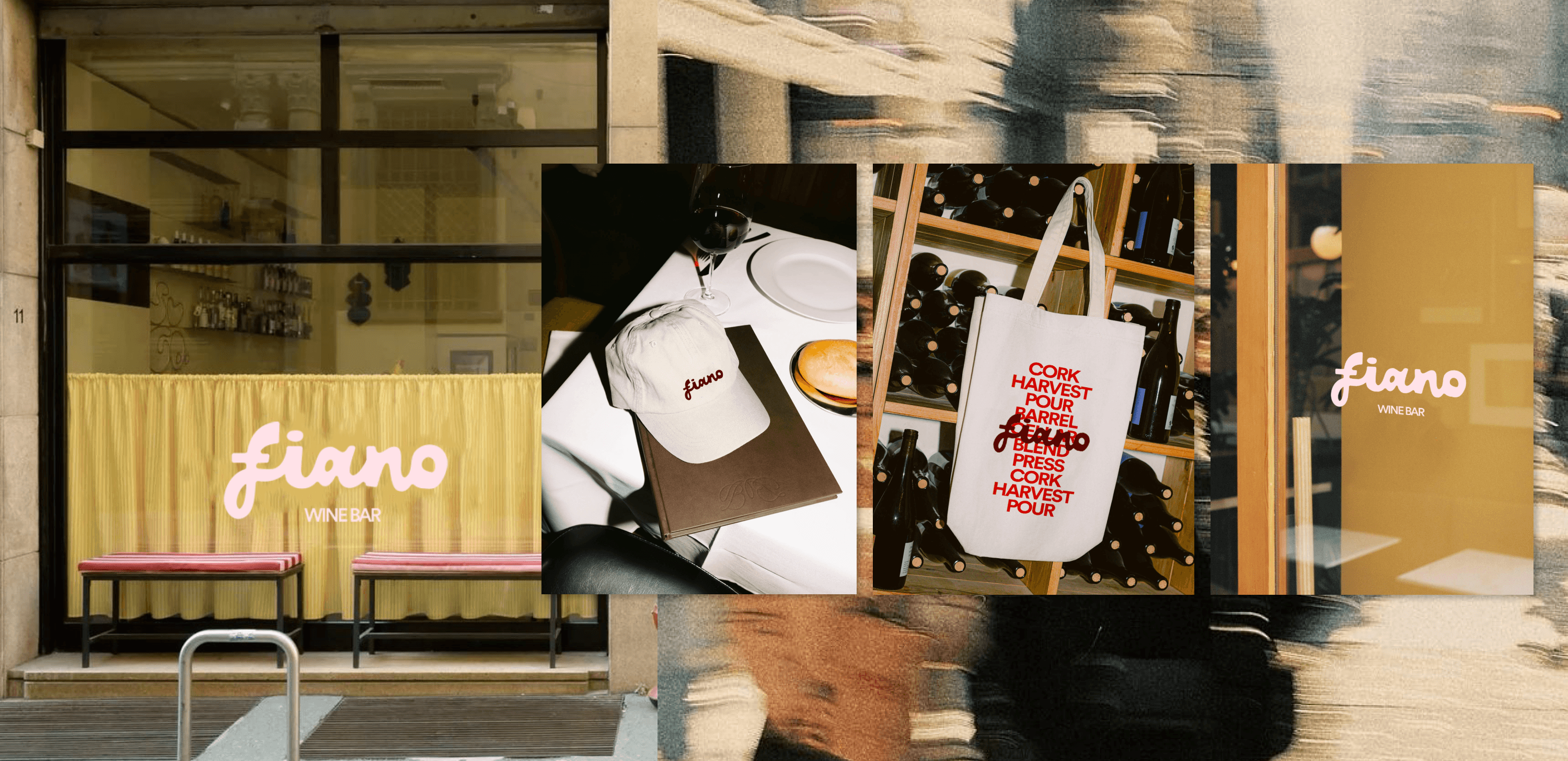
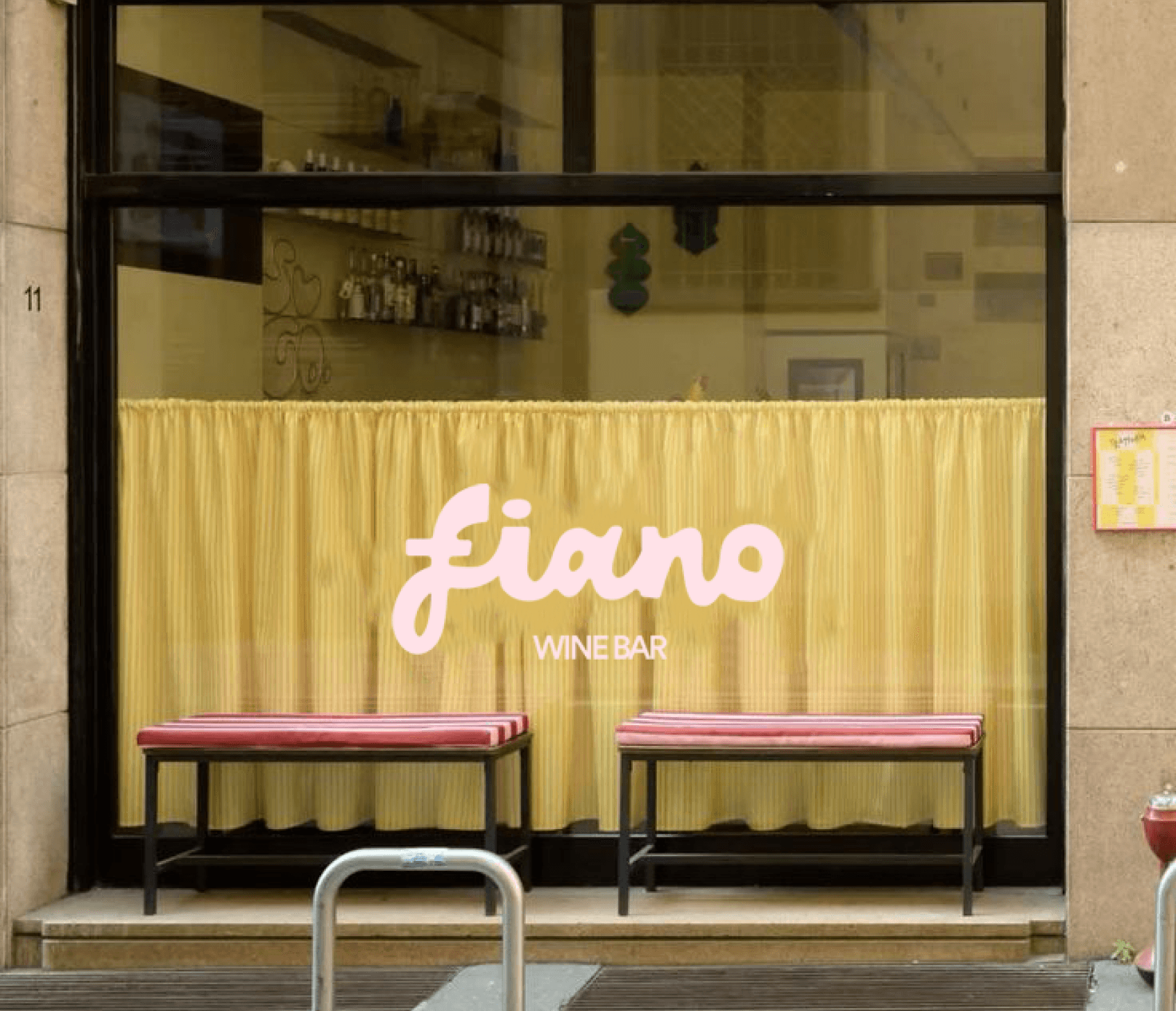
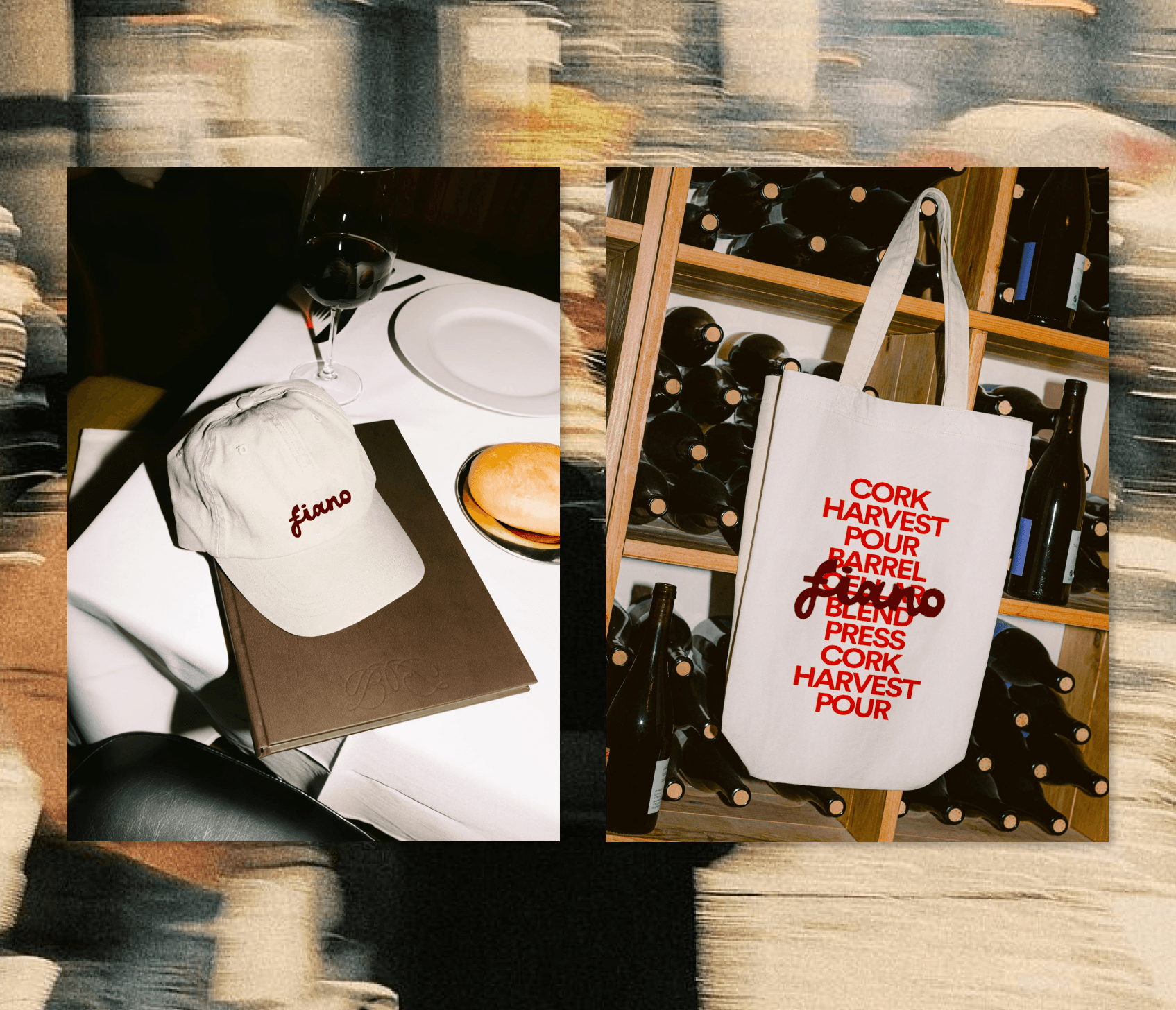
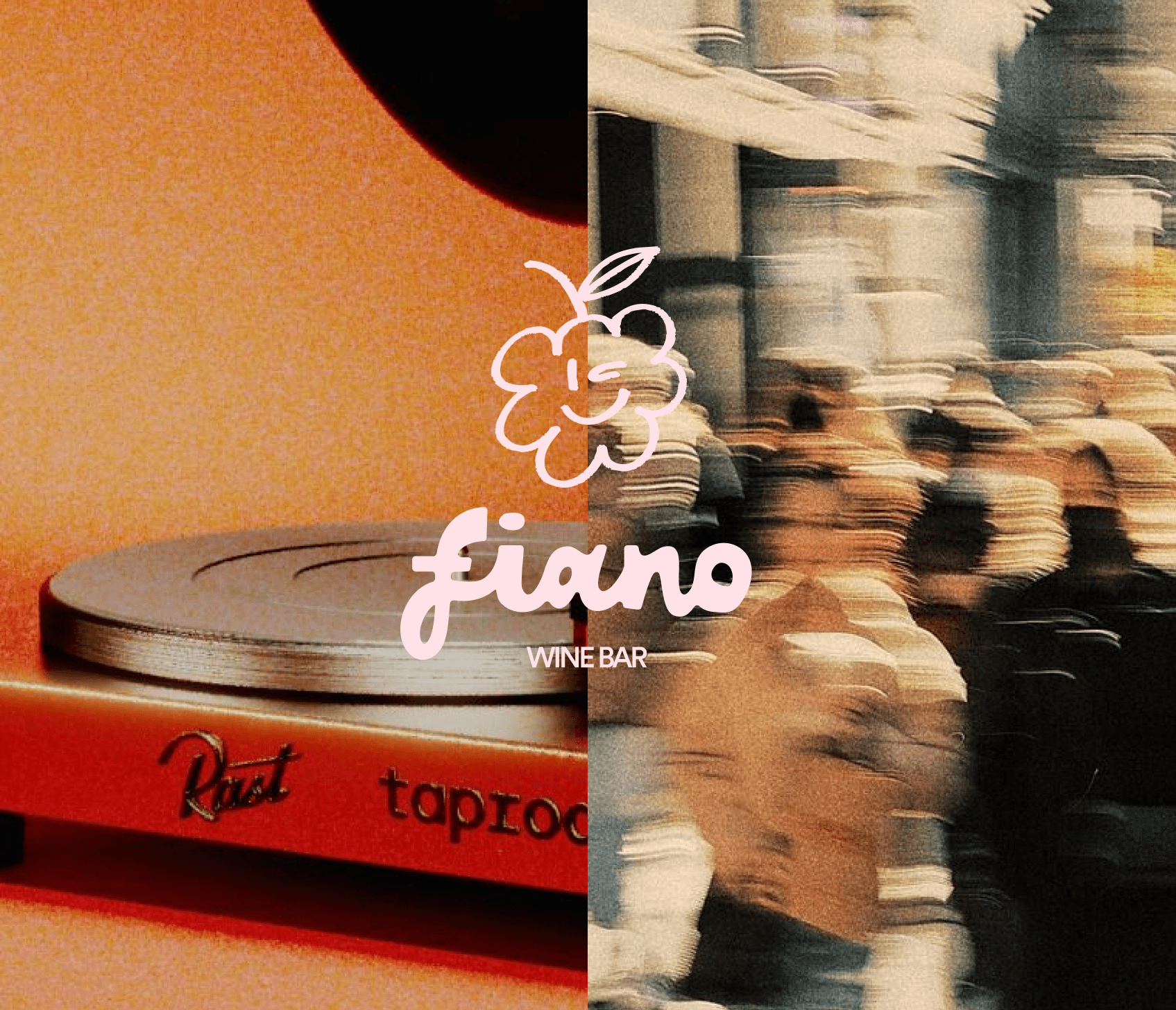
We explored the culture of intimate wine bars and the sensory rituals that make them memorable — the pour, the clink, the vinyl hum in the background. Drawing from 70s-inspired typography, soft lighting, and the tactile quality of natural materials, we created a brand that feels both nostalgic and current.
The identity centres around a script logo that feels handwritten and familiar, paired with a rich, warm palette of wine reds, blush pinks, and creamy neutrals. The design system uses bold typography and organic shapes to echo the rhythm of conversation and movement within the bar. Every touchpoint — from menus to merch — carries that same inviting, effortless charm.

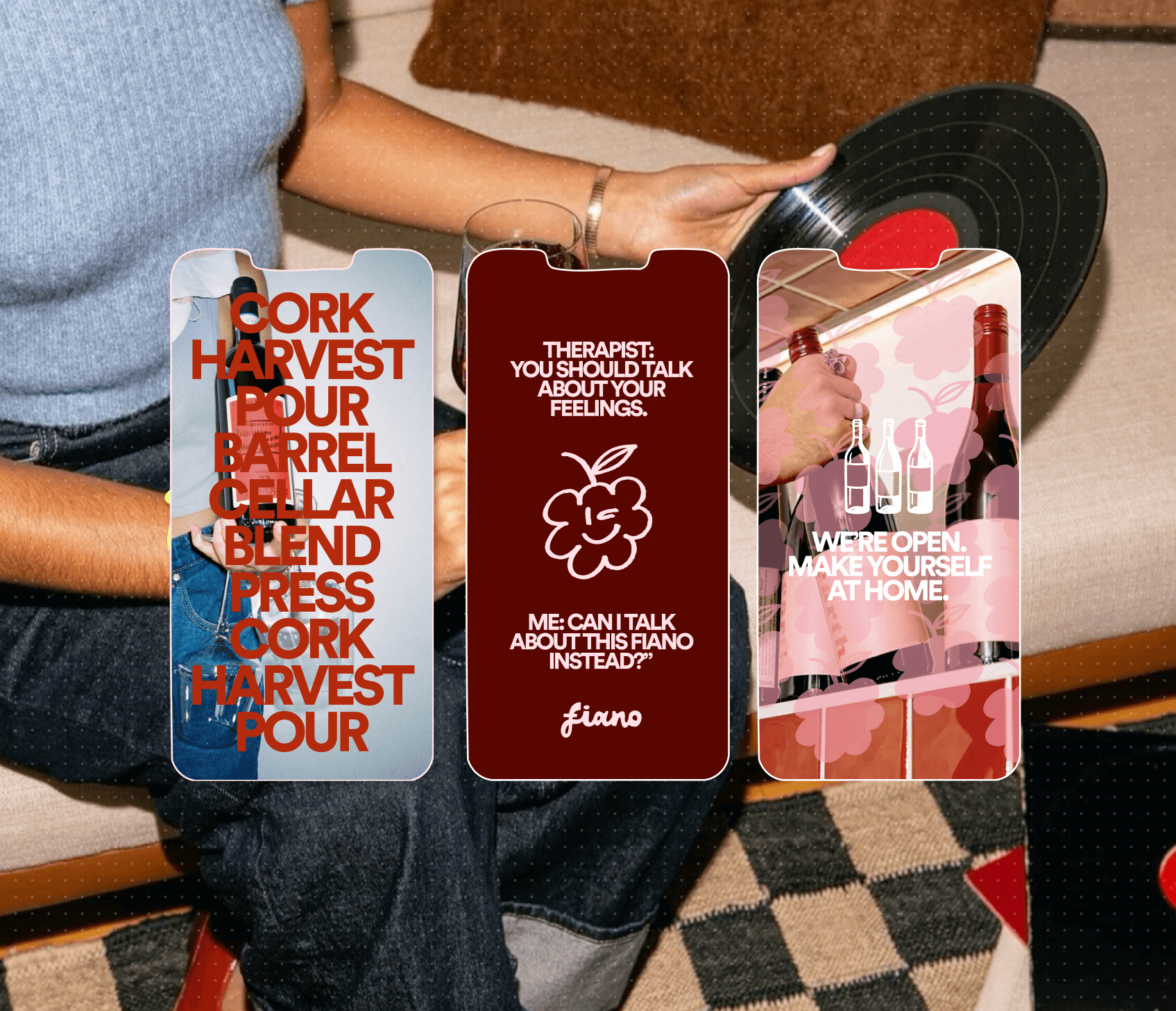
From print collateral to digital presence, the brand was developed to feel cohesive across every space it lives in. The website and social touchpoints reflect Fiano’s atmosphere — approachable, soulful, and a little bit cheeky — while maintaining visual harmony through consistent tone and texture.


Fiano is a neighbourhood wine bar built on warmth, connection, and good taste — literally. The concept celebrates the rhythm of slow nights, vinyl records, and stories shared over a glass (or two). The brand needed to feel elevated yet unpretentious, balancing playfulness with sophistication.